Pricing Page Psychology: What Actually Converts in 2026
By José Antonio Mijares | 2026-01-10 | 6 min read
Your pricing page is where deals die or close. Learn the psychological principles and design patterns that turn browsers into buyers, backed by real A/B test data.
Pricing Page Psychology: What Actually Converts in 2026
Your pricing page is the most important page on your website. It's where interest becomes intent, and intent becomes revenue. Yet most businesses treat it as an afterthought.
We've analyzed hundreds of pricing pages and run thousands of A/B tests. Here's what actually works.
Why Pricing Pages Fail
Before we get to what works, let's understand why most pricing pages underperform:
- Too many options - Decision paralysis kills conversions
- Features, not outcomes - Nobody cares about "unlimited API calls"
- No clear recommendation - Visitors don't know what to choose
- Missing trust signals - High prices + low trust = abandoned tabs
- Friction at the end - "Contact sales" after showing prices is a mood killer
Fix these, and you'll outperform 90% of competitors.
The Psychology of Pricing
Anchoring: Set the Reference Point
The first price someone sees becomes their anchor. Everything else is compared to it.
Application: Lead with your highest-priced option (or an even higher "enterprise" placeholder). Your mid-tier suddenly looks reasonable.
Test result: Moving enterprise pricing to the left increased mid-tier conversions by 23% for a SaaS client.
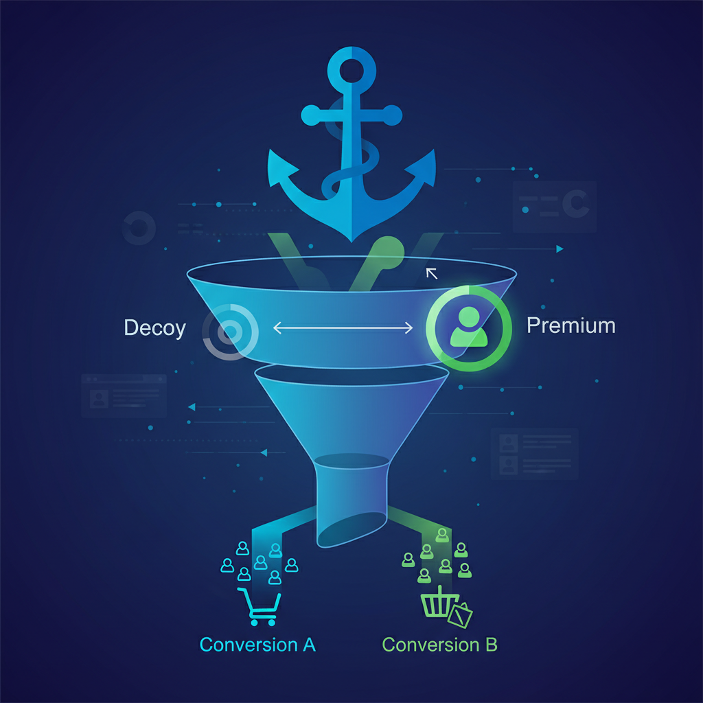
The Decoy Effect: Guide the Choice
Adding a slightly inferior option makes your target option look better by comparison.
Classic example:
- Basic: $9/month (100 contacts)
- Pro: $29/month (1,000 contacts)
- Business: $49/month (10,000 contacts)
The jump from Basic to Pro feels steep. Add a decoy:
- Basic: $9/month (100 contacts)
- Plus: $19/month (200 contacts) ← Decoy
- Pro: $29/month (1,000 contacts)
- Business: $49/month (10,000 contacts)
Now Pro looks like obvious value. You pay $10 more than Plus but get 5x the contacts.
Loss Aversion: Fear Beats Desire
People fear losing more than they desire gaining. Use this carefully.
Weak: "Get unlimited storage" Strong: "Never lose a file again"
Weak: "Access premium support" Strong: "Don't wait 48 hours for help when things break"
Frame features in terms of problems avoided, not benefits gained.
Social Proof: Reduce Perceived Risk
At the moment of purchase, doubt peaks. Counter it with evidence.
Effective social proof on pricing pages:
- Number of customers (especially at each tier)
- Logos of recognizable companies
- Specific results: "Acme Corp increased conversions 47%"
- Reviews that mention value for money
Less effective:
- Generic testimonials
- Vague claims: "Thousands of happy customers"
- Reviews about features, not outcomes
The Anatomy of a High-Converting Pricing Page
1. Clear Value Proposition Above the Fold
Before showing prices, remind visitors what they're buying.
Formula: [Outcome] + [Timeframe] + [Differentiator]
Example: "Increase conversions in 90 days with our proven 68-task methodology"
2. Three Tiers (Maximum)
Three is the magic number. It's enough to offer choice without causing paralysis.
The classic structure:
- Starter/Basic: Entry point, limited features, low commitment
- Pro/Growth: Best value, most features most people need, recommended
- Enterprise: Premium, custom, high-touch
More than three tiers? You probably have a product complexity problem, not a pricing page problem.
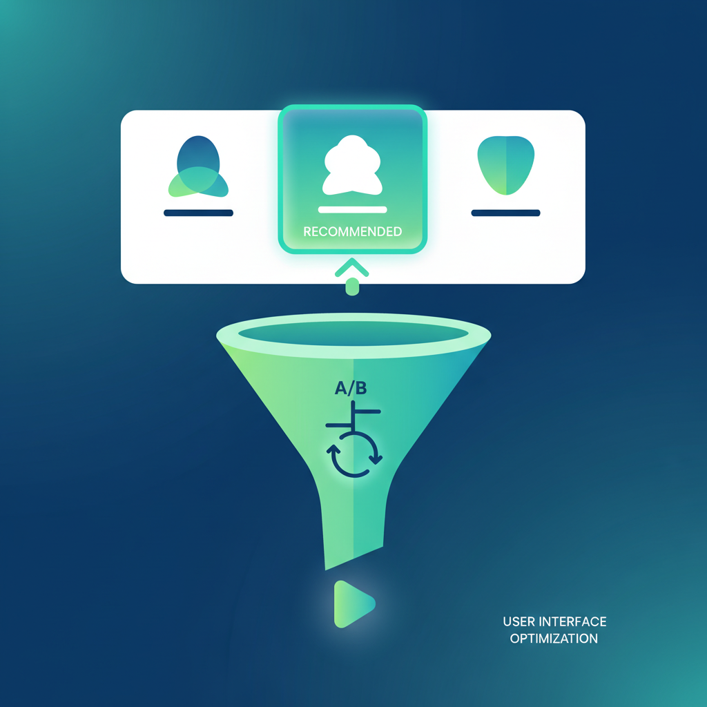
3. Highlight the Recommended Option
Make the choice obvious. Highlight your target tier with:
- Visual distinction (larger card, different color, border)
- "Most Popular" or "Best Value" badge
- Default selected state
Test result: Adding a "Most Popular" badge increased selection of that tier by 34%.
4. Features as Outcomes
Nobody buys features. They buy what features enable.
| Weak (Feature) | Strong (Outcome) |
|---|---|
| 10 user seats | Your whole team, one price |
| Advanced analytics | Know exactly what's working |
| Priority support | Get answers in hours, not days |
| API access | Connect to tools you already use |
5. Transparent Pricing (Yes, Show Numbers)
"Contact sales" is conversion death for most businesses.
When to hide pricing:
- Enterprise deals with genuinely custom requirements
- Average deal size > $50k/year
- Complex implementation requirements
When to show pricing:
- Self-serve purchase expected
- Deal size < $10k/year
- Competitors show pricing
If you're hiding prices because you're scared of competitors, you have a positioning problem.
6. Risk Reversal
Reduce the fear of making a wrong choice:
- Free trials (14-30 days, no credit card)
- Money-back guarantees (30-60 days)
- Easy downgrade/cancel policies
- Month-to-month options (even if annual is encouraged)
Test result: Adding a visible "Cancel anytime" note increased conversions 18%.
7. The FAQ Section
Answer objections before they stop the sale:
- "What happens if I need to upgrade/downgrade?"
- "Is there a setup fee?"
- "What payment methods do you accept?"
- "Do you offer refunds?"
- "Is my data secure?"
Advanced Tactics
Annual vs. Monthly Toggle
Most SaaS companies want annual commitments (better LTV, predictable revenue). But...
Default to monthly, show annual savings.
Visitors who see monthly first feel less trapped. They're more likely to consider annual when presented as a discount.
Test result: Defaulting to monthly (with visible annual discount) increased overall signups by 12%, with no decrease in annual conversion.
The Zero-Risk Start
Remove all friction from the first step:
- No credit card for free trial
- Instant access (no sales call required)
- Pre-filled setup with sensible defaults
Every additional step loses 10-30% of potential customers.
Price Justification
For higher price points, justify the investment:
- ROI calculator: "If you convert just 1% more visitors..."
- Time saved: "Save 10 hours per week..."
- Comparison: "Less than one cup of coffee per day"
Exit Intent
When someone's about to leave your pricing page, you have one last chance:
Effective exit intents:
- Extended trial offer
- Discount for immediate signup
- Option to talk to a human (chat)
Ineffective exit intents:
- Newsletter signup (wrong moment)
- Generic "wait, don't go" messages
- Aggressive discounting that trains future visitors to wait

What to Test First
If you're just starting CRO on your pricing page, test in this order:
- Number of tiers - Do you need all of them?
- Recommended option - Is it highlighted clearly?
- Feature framing - Outcomes vs. features
- CTA copy - "Start free trial" vs. "Get started" vs. specific
- Social proof placement - Where does it have most impact?
The Pricing Page Checklist
Run through this before launching or testing:
- Value proposition clear above the fold
- 3 tiers maximum
- Recommended tier visually highlighted
- Features framed as outcomes
- Prices visible (not hidden behind "contact us")
- Risk reversal present (trial, guarantee, etc.)
- Social proof specific and credible
- FAQ addresses common objections
- CTA is clear and action-oriented
- Mobile experience tested
The Bottom Line
Your pricing page isn't about presenting prices. It's about making the decision easy and the risk low.
Lead with value. Guide the choice. Remove friction. Reverse risk.
Do these well, and your pricing page becomes your best salesperson.
Frequently Asked Questions
Q: How many pricing tiers should I offer?
Three tiers maximum. This provides enough choice without causing decision paralysis. The classic structure is: Starter (low commitment entry), Pro/Growth (best value, recommended), and Enterprise (premium, high-touch). More than three tiers usually indicates a product complexity problem, not a pricing page problem.
Q: Should I hide my pricing behind "Contact Sales"?
Only hide pricing if: (1) you sell enterprise deals over $50k/year, (2) you have genuinely custom requirements, or (3) implementation is complex. For self-serve products under $10k/year, always show pricing—"Contact sales" is conversion death for most businesses.
Q: What's the most effective pricing page test to run first?
Start by testing whether your recommended tier is clearly highlighted. Adding a "Most Popular" or "Best Value" badge typically increases selection of that tier by 30%+. After that, test the number of tiers, feature framing (outcomes vs. features), and CTA copy.
Key Takeaways
- Three tiers maximum: More options create decision paralysis—stick to Starter, Pro, and Enterprise
- Use anchoring effectively: Lead with your highest-priced option so your target tier looks reasonable by comparison
- Frame features as outcomes: Nobody buys "10 user seats"—they buy "your whole team, one price"
- Reverse risk aggressively: Free trials, money-back guarantees, and visible "cancel anytime" notes increase conversions 18%+
- Highlight the recommended option: Visual distinction and badges ("Most Popular") can boost selection by 34%
Want a professional analysis of your pricing page? Our friction analysis identifies exactly where you're losing conversions. Get your free audit